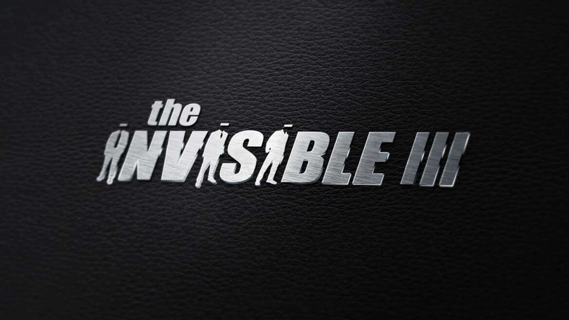
The Invisible 3 Logo Design — Negative Space Meets Concept-Driven Typography
The Invisible 3 logo was designed to visually reinforce the brand’s name through smart negative space, custom typography, and a concept-forward detail that makes the mark instantly memorable. Built around the theme of “invisible,” this identity leans into subtlety, contrast, and visual discovery—creating a logo that feels bold at first glance, yet reveals deeper meaning the longer you look.
Concept & Brand Story
At its core, the Invisible 3 logo is a play on perception. The goal was to create a logo design that feels sleek and modern, while also delivering a hidden narrative tied directly to the name. The result is a strong typographic mark with a cinematic edge. Perfectly minimal, impactful, and intentionally layered.
Negative Space as a Primary Design Element
One of the key design strategies used in this logo is negative space. By allowing the background to interact with the letterforms and silhouettes, the design creates depth without relying on extra shapes or visual clutter. This approach strengthens readability while also enhancing the “invisible” concept—giving the logo a subtle, almost disappearing effect depending on where the eye focuses.
People Icons Replacing the Letter “I”
The standout feature of the Invisible 3 logo is the clever use of human figure icons in place of the letter “I.” This wasn’t just a stylistic choice—it’s a thematic decision that connects the brand identity to the idea of presence, absence, and being unseen.
Even better, the word “INVISIBLE” naturally contains three “I’s,” allowing the design to feature three human silhouettes without forcing the concept. That detail ties perfectly into the “3” in the name, completing the visual story in a way that feels intentional and cohesive.
Typography, Weight, and Structure
The typography was chosen to feel bold, modern, and slightly industrial—supporting a strong, high-impact wordmark. The use of thick strokes and clean angles ensures the logo remains legible across different sizes and applications, while the balanced spacing keeps the icon replacements from feeling distracting. The overall structure creates a smooth visual rhythm from left to right, with the “III” effect acting as both a focal point and a storytelling element.
Final Result
The Invisible 3 logo is a strong example of how logo design can go beyond aesthetics and become a brand statement. By combining negative space, symbolic iconography, and purposeful typography, the mark delivers a clean professional look while also embedding a hidden concept that reinforces the name and identity in a memorable way.
Services Featured: Logo Design, Brand Identity Design, Custom Typography, Negative Space Design, Icon Integration