

Planck Chiropractic Logo Design — Charlotte-Inspired Branding with a Modern touch
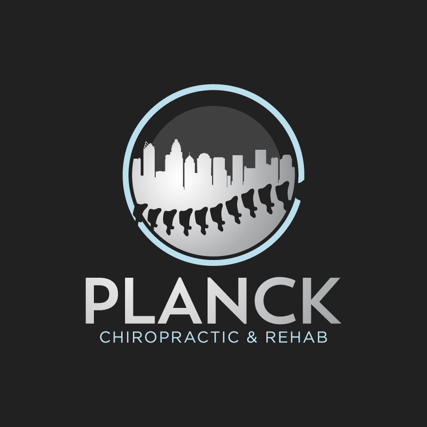
The Planck Chiropractic & Rehab logo was designed to feel modern, professional, and approachable—creating a brand identity that builds trust while staying inviting for new and returning patients. This custom logo design combines clean typography with a concept-driven icon that connects chiropractic care to the local community in Charlotte, NC.
Concept & Local Brand Connection
At the heart of the identity is a circular emblem featuring the Charlotte city skyline, reinforcing the practice’s local presence and giving the brand a strong sense of place. This subtle regional tie-in helps the logo feel grounded, recognizable, and community-focused—ideal for a wellness provider built on relationships and long-term care.
Negative Space Spine Detail
A key feature of this logo design is the use of negative space to create a stylized spine running parallel to the skyline. The repeating spinal shapes form a clean, rhythmic pattern that instantly communicates chiropractic and rehabilitation services without relying on overly literal medical symbols. This approach keeps the mark visually engaging, clever, and memorable while staying polished and professional.
Clean Typography & Strong Readability
The typography was selected to support the brand’s professionalism while remaining friendly and easy to read. The bold “PLANCK” wordmark provides confidence and clarity, while the secondary line “Chiropractic & Rehab” adds structure and balance—creating a clear hierarchy that works across both print and digital branding.
Built for Versatile Healthcare Branding
Designed with scalability in mind, the Planck Chiropractic logo works seamlessly across signage, business cards, patient materials, uniforms, social media, and website branding. The icon functions as a standalone mark for quick recognition, while the full lockup supports a complete brand identity system.
Final Result
The Planck Chiropractic & Rehab logo is a concept-driven logo design that blends local Charlotte identity with smart negative space to form a spine-inspired symbol. The final mark is modern, welcoming, and professional—perfectly representing a chiropractic practice focused on movement, recovery, and patient care.
Services Featured: Logo Design, Chiropractic Branding, Healthcare Logo Design, Negative Space Design, Custom Icon Design, Typography Design


2 Comments
Comments are closed.