Charlotte Phoenix Logo Redesign — A Bold Rebrand Built to Rise
The Charlotte Phoenix logo redesign was created to modernize the team’s identity while staying true to the meaning behind the name. This project focused on elevating the original logo into a sharper, more competitive mark, delivering a bold, sports-themed logo design and branding system that represents the Phoenix spirit of rising from the ashes with strength, energy, and purpose.
A Fresh Identity Built on the Phoenix Story
A phoenix is more than a mascot, it’s a symbol of resilience, rebirth, and momentum. This redesign embraces that narrative by creating a stronger, more modern brand mark that reflects growth and transformation. The updated logo gives the Charlotte Phoenix a new look that feels confident and forward-moving, while reinforcing the idea of a team that continues to evolve and rise.
Sleek Icon Design with Strong Visual Flow
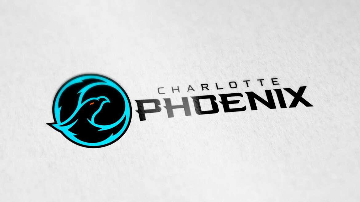
The icon features clean, streamlined shapes that form a bold phoenix head in a circular emblem. The smooth curves and sharp edges create a sense of motion, almost like the phoenix is cutting through the air, making the design feel fast, focused, and competitive. This modern icon-work is built for versatility, working as a standalone symbol for helmets, jerseys, social media, and merchandise.
Vivid Color Scheme for Energy & Recognition
The color palette was intentionally chosen to stand out in a sports and esports environment. The vivid teal tones create a high-energy, modern look while offering instant visibility across digital and print platforms. The contrast against darker elements adds depth and impact, giving the logo a strong presence whether it’s used on apparel, signage, or online branding.
Esports-Centric Typography Using “Flight Risk”
To complete the identity, the wordmark features the “Flight Risk” font. An aggressive, modern type style that feels right at home in competitive sports branding. The typography adds edge and intensity, reinforcing the Phoenix theme through a high-impact, esports-inspired look. The combination of the emblem and wordmark creates a cohesive logo system that feels current, bold, and ready for modern team branding.
Final Result
The Charlotte Phoenix logo redesign is a modern logo design and branding project built around symbolism, motion, and competitive energy. With sleek iconography, a vivid color palette, and esports-inspired typography, the updated identity captures what a phoenix represents rebirth, resilience, and rising stronger than before.
Services Featured: Logo Design, Brand Identity Design, Sports Logo Design, Esports Branding, Logo Redesign, Custom Icon Design, Typography Selection


10 Comments
Comments are closed.