Waterfall Medical Logo Design — Clean Negative Space with a Fluid, Modern Mark
The Waterfall Medical logo was designed to reflect the brand’s focus on professionalism, trust, and forward-thinking healthcare solutions. This custom logo design combines a sleek typographic system with a bold WM icon, using smart negative space to create a hidden waterfall effect—tying the name and visual identity together in a subtle, memorable way.
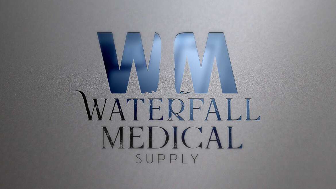
Concept-Driven “WM” Icon Design
At the center of the logo is the WM monogram, built with smooth, confident letterforms that feel modern and structured. The icon was designed to be strong enough to stand alone for brand recognition, while still pairing seamlessly with the full “Waterfall Medical Supply” wordmark for complete identity usage across print and digital platforms.
Negative Space Waterfall Effect
One of the most intentional design elements is the use of negative space between the “W” and “M.” This space forms the shape of a waterfall, creating a clean visual illusion that reinforces the brand name without adding extra graphics or clutter. This approach keeps the logo minimal and professional, while adding a clever detail that makes it more unique and engaging.
Smooth Lines & Balanced Typography
The logo’s typography was chosen to communicate reliability and clarity—key traits for any medical or healthcare-related brand. The mix of bold and refined type creates hierarchy and readability, while the smooth curves and clean edges give the overall identity a polished, premium feel.
Built for Versatile Medical Branding
The Waterfall Medical logo was designed to scale well across multiple applications including packaging, uniforms, signage, websites, and marketing materials. The monogram icon works especially well for social media avatars, embroidered apparel, and product labeling—ensuring consistent brand recognition across every touchpoint.
Final Result
The Waterfall Medical logo is a modern, concept-driven logo design that uses negative space, clean geometry, and smooth typography to create a distinctive mark. With a hidden waterfall built directly into the WM icon, the final identity feels professional, memorable, and perfectly aligned with the brand’s name and purpose.
Services Featured: Logo Design, Medical Branding, Custom Monogram Design, Negative Space Design, Typography Design
16 Comments
Comments are closed.